When it comes to selecting new paint colours for your home, many of us simply choose hues that appeal to us personally and think nothing more of it. However, particular colours can have a psychological effect on our subconscious, and affect our moods or feelings when we are around them.
We asked Lysn psychologist Noosha Anzab for her advice on using colour psychology in the home, and which colours you should use in your living area, bedrooms, bathrooms or offices.
The colours:
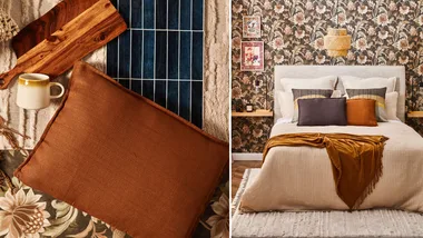
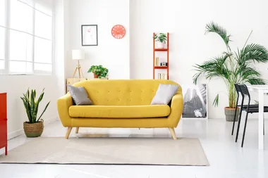
Red, orange and yellow
The colour psychology:
As a general rule, warmer colours such as red, orange and yellow often evoke feelings of optimism, happiness and energy. Warmer colours are also associated with stimulation and revitalization, which is important to keep in mind. Often, we see that these colours are used in warning signs, like the red used in a stop sign. We also see yellow or orange on high-visibility shirts. Interestingly enough, when some of these colours are paired together, they can evoke other senses such as appetite. It’s no surprise that McDonalds chose red and yellow for their logo.These colours together can make you hungry. However, be cognisant that warmer colours can sometimes be known to activate the anxiety centre of the brain, so use them sparingly to avoid any potential negative connotations.
Where to use these colours in the home:
“Red can be known to raise a room’s energy levels and is great for the lounge room if you want to stir up excitement and spark conversation.”
“Yellow can be used a great option for kitchen, dining rooms and bathrooms to brighten and bring joy to these spaces.”
“Orange is an energetic colour. It’s best not to use orange in places where it’s important to relax (like the bedroom). Instead, use it in a home gym or exercise room as it’s known to increase energy levels and motivation.”
The colours:
Blue, green and purple
The colour psychology:
These colours are known as cool colours and are generally associated with feelings of calmness and relaxation, but certain shades are also associated with sadness. Green is symbolic of wealth, health and new beginnings and can be used to create a relaxing space that can inspire feelings of growth and possibility.
Where to use these colours in the home:
“Blue is great for interior design, but different shades of blue can evoke different feelings. For example, lighter blue colours are calming and friendly, making them great for bedrooms or rooms where you need to relax. It’s no surprise that some of our favourite social networking apps have chosen these shades (hello Twitter and Facebook). Darker blue colours, such as navy, are often associated with professionalism , and are great for offices or corporate spaces. Be careful though, too much dark blue can evoke feelings of coldness.”
“Purple is associated with royalty and romance, and the lighter shades can be a great colour to incorporate into bedrooms.”
The colours:
Grey, black, white & brown
The colour psychology:
Most people will argue that these cohort of colours are actually shades. They are considered neutral and are a basic necessity for any interior design. They are all flexible colours that can stand the test of time, allowing you to spruce up a place with injections of colours in furniture and art.
How to use these colours in your home:
“Black is best used in small doses to give a room a bit of depth, but use sparingly as in some cultures it is associated with death and mourning. It can also be associated with unhappiness and formality, so ensure that you be mindful about where you use it.”
“White is associated with innocence, goodness and purity. It’s a fantastic base for bedrooms, such as a child’s room. White is also associated with cleanliness so it’s a great choice for bathrooms and kitchens.”
“Grey is an interesting colour as it is typically emotionless, but it is associated with dullness and dirtiness. Dark charcoal evokes similar feelings to that of black, so is considered a stronger colour and should be used sparingly. Grey is best used to accentuate rooms rather than be the focus point, it can give some depth to a bathroom, but be mindful of the shade and how it might make a room look dull, boring or flat.”
“Brown is a natural colour that is typically associated with the seasons of nature – think the wood on trees, brown of the dirt, or falling leaves. It is associated with security, reliability, warmth, and approachability so can be used in a lounge or dining room to bring a sense of comfort.”
You might also like:
The interiors trend taking off on Pinterest
Decor trends that don’t work in real life
10 must-have botanical prints under $100
Related stories
Native ad body.
Native ad body.
Native ad body.